.png)
Why Visitors Leave Your Website in Seconds (and How to Keep Them)
Why visitors leave your website in seconds, the five reasons behind fast bounces, and the first screen fixes that keep the right people scrolling.

Visitors leave a website within seconds because the first screen gives them no reason to stay. The usual causes are a headline that says nothing, a look that's smaller than your business, no visible proof, a slow or awkward mobile experience and no obvious next step. Fix the first screen for one person and most of that stops.
You open your analytics. Traffic is fine. People are turning up.
Then you look at how long they stay. Eight seconds. Twelve seconds. Gone.
No enquiry. No scroll. Just a visit that looks like someone opened the front door, glanced in, and walked off.
If you run an established service business, this is one of the most frustrating things to look at. You are good at what you do. People are finding you. And then your website, the thing that is supposed to close the deal while you sleep, is quietly showing them out.
The good news is that people leave websites for very predictable reasons. Once you know why visitors leave your website, you can fix it, and most of the fixes are not technical. They are about what your site says and how quickly it says it. Let's go through them.
What actually happens in the first eight seconds
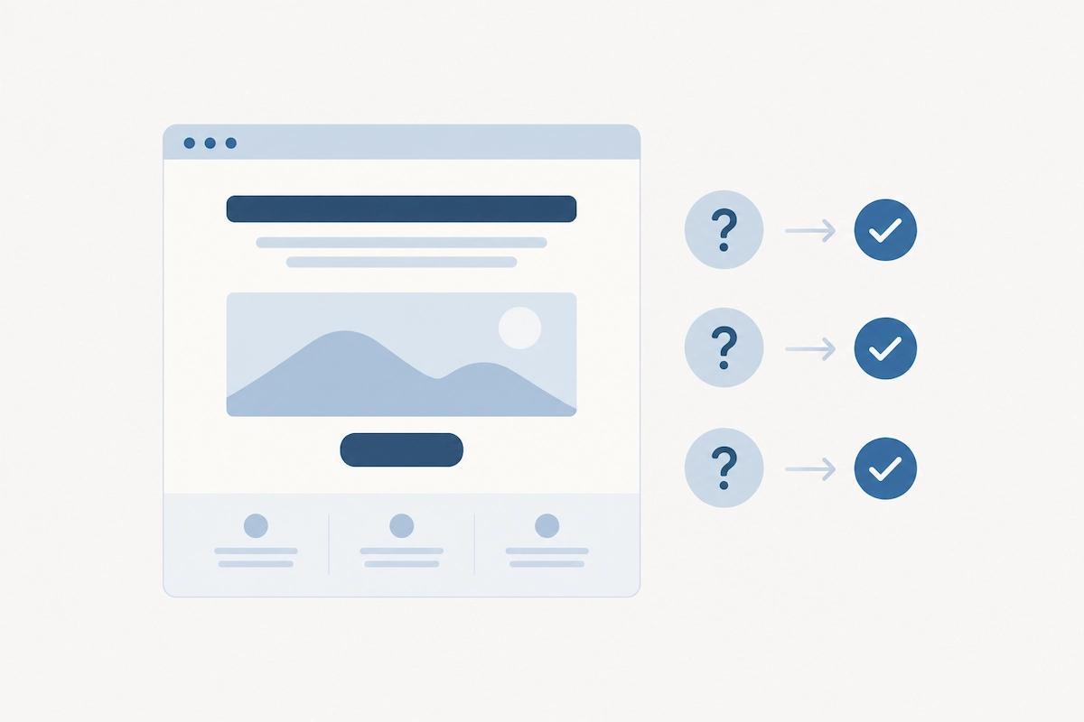
A visitor lands on your homepage with three questions already loaded. Am I in the right place? Is this for someone like me? Do these people look like they can actually help?
They do not read. They scan. The headline, the first image, maybe the first line under the headline. If those three things answer the three questions, they scroll. If not, they hit back and try the next result.
That is the whole game. Not your services page. Not your beautifully written about page. The first screen, in the first few seconds.
The bounce is a decision, not an accident
When someone leaves in seconds, they make a judgement call. Usually it is "not sure this is for me" or "this looks less established than I expected." Neither of those is about your work. Both are about how your work is presented. The problem is the distance between how good you are and how good you look online, and fast bounces are one of its clearest symptoms.
The five reasons visitors leave your website
Reason one: your headline says nothing
"Welcome to our website." "Helping businesses thrive." "Strategic solutions for modern organisations." I see these every week in a brand & web audit. They are not wrong, they are just empty. A visitor cannot tell what you do, who you do it for, or why they should care.
A headline that keeps people needs to name the person and the change. "Brand and website strategy for consultants who are better than their website suggests." Specific enough that the right person feels seen, and the wrong person leaves quickly, which is fine. The same rule runs through all website copy that converts: name the person, name the change.
Reason two: it looks like a smaller business than you are
You have grown. Your site has not. The template look, the stock photo of a handshake, the logo from 2016. A visitor forms a view of your level in a heartbeat and if that view is "small and cheap," they leave before they find out you charge premium rates and deliver premium results. I unpack this in when your website no longer matches how good you've become.
Reason three: there is no proof where they can see it
Claims are cheap. Evidence keeps people. If your results, client names, and outcomes are buried three pages deep, the visitor has to trust you before they have any reason to. Pull proof up to the first screen or just below it. Have a look at how I lead every one of my case studies with the result. That is deliberate.
Reason four: it is slow or awkward on a phone
In my experience, at least half of a service business's visitors are on a phone. If the page takes four seconds to load, or the text is tiny, or the menu does not work, they are gone before your headline even shows. This is the one technical fix on the list and it matters. Speed and mobile layout are table stakes, not nice-to-haves.
Reason five: there is nothing obvious to do next
Even a visitor who likes what they see needs a clear next step. If the only button says "Learn more" and leads to a wall of text, they lose momentum. One clear action, visible without scrolling, repeated at the bottom. Book a call. Start with an audit. Whatever your first step is, make it impossible to miss.
Why do visitors leave a website within seconds?
Visitors leave a website within seconds when the first screen fails to answer three questions: is this for me, what do you do, and can you actually help. Vague headlines, an outdated look, missing proof, slow mobile loading and no clear next step all trigger an instant exit before the visitor ever scrolls.
Not sure what your website is actually costing you?
Four Questions. Two minutes
How to keep them: the fixes that actually move the needle

You do not need a new website to fix most of this. You need to change what the first screen says and what it looks like.
Rewrite the first screen for one person
Pick your ideal client. Write a headline that names them and the outcome they want. Add one line underneath that says how you do it differently. Put your primary call to action right there. This one change is worth more than every other page on your site combined. If you want the full list, here is what a homepage should include.
Put proof above the fold, or just below
A client logo strip, one strong result, or a single quote in the client's own words. Something that says "other people like you trusted this and it worked" before the visitor has to take your word for anything.
Make the look match the level
If you charge $10,000 plus for an engagement, your website needs to look like it. That does not mean flashy. It means clean, confident, current, and consistent with the level of client you want. This is usually where True Bearings, my strategy and website engagement, comes in, because strategy has to come before the design or you end up with a prettier version of the same problem.
Cut the choices
Fewer menu items. One primary button. One offer at the front. Every extra option is a chance to hesitate, and hesitation on a website turns into leaving.
Check it on your own phone
Right now. Open your site on your phone on mobile data, not wifi. Time it. Scroll it. Try to find the contact button. If anything annoys you, it is annoying your visitors ten times more.
What it looks like when the first screen works
Iconic Balloons did not get a full rebuild. It was a structural clean-up only: clear headings, proper page structure, fixed foundations. Impressions went from around 20 to more than 100 a day, clicks went up three to five times, and their ranking moved from position 40 to 18. Nothing flashy. Just a site that told Google and visitors what it was about, fast.
Elysian Lawns and Gardens had no online presence at all. A clear brand, a clear first screen, and a clear next step brought in 183 organic search visitors in three months. People stayed because the site answered their questions before they had to ask.
Your website is not losing people. Your first screen is.
When visitors leave in seconds, it is tempting to blame the traffic, the algorithm, or the platform. It is almost never those things. It is the gap between what your visitor needed to see in the first eight seconds and what your site actually showed them.
Close that gap and everything downstream improves. More scrolls, more time on page, more enquiries from the same traffic you already have. That is the cheapest growth available to you, and it is sitting on your homepage right now.
What is a good bounce rate for a service business website?
In GA4, bounce rate is the share of sessions that were not engaged, meaning the visitor stayed under 10 seconds, viewed one page and did nothing that counts as a key event. So it reads differently from the old figures you may remember. Rather than chasing a benchmark, watch engagement rate and average engagement time on your homepage, and whether enquiries rise after you change the first screen.
Does website speed really affect whether people stay?
Yes, especially on mobile. Every second of load time increases the chance a visitor leaves before your content shows. Compress images, remove unused scripts and check your site on mobile data. Speed will not fix a vague headline, but a slow site will undo a good one.
Do I need a new website to stop people leaving?
Not always. If the design is current and the site is fast, rewriting the first screen, adding proof and fixing the call to action can make a big difference. If the site looks smaller than your business or the structure is broken, a strategy-led rebuild is usually the faster route to results.